Here’s a quick one. I was recently asked how you might plot the travel of individuals over time on a map. For example, if you had longitudinal data recording the residences of respondents over a course of many years, it might be interesting to see to where and how far they traveled. Doing this in R isn’t too difficult, but it isn’t quite straightforward either. Below I’ll show off my approach using the sf package.
Code
library(tidyverse)library(sf)set.seed(111424)# load data# cities data: https://simplemaps.com/data/us-cities# usa states: https://www2.census.gov/geo/tiger/GENZ2018/shp/cb_2018_us_state_500k.zipcities <-read_csv("./data/uscities.csv")usa <-st_read("./data/usa_states/cb_2018_us_state_500k.shp")# create a base layer mapusa_map <- usa %>%filter(NAME %in% state.name,!NAME %in%c("Alaska", "Hawaii")) %>%st_transform(crs =4326)# subset 50 largest us citiescities_sub <- cities %>%filter(state_name %in% state.name,!state_name %in%c("Alaska", "Hawaii")) %>%slice(1:50)
Let’s say we have some data which lists the name of a person, the cities they’ve been to, and the dates they moved. We want to create a plot that draws a line (in order) of their travel between cities. A sample dataset might look something like this below. We have a person identifier and a sequence of dates that display the dates they lived in a location, along with the associated latitude and longitude.
Code
N <-sample(1:length(cities_sub), 3)# sample of datasample_d <- cities_sub %>%slice(N) %>%mutate(person_id ='a12345',from_date =as.Date(c('2016-12-31','2018-04-07','2024-03-03'))) %>%select(person_id, city, from_date, lat, lng)kable(sample_d)
person_id
city
from_date
lat
lng
a12345
Seattle
2016-12-31
47.6211
-122.3244
a12345
Houston
2018-04-07
29.7860
-95.3885
a12345
Phoenix
2024-03-03
33.5722
-112.0892
Now what we want to do is find a way to plot these as a linestring on a map. To do this we can create a simple function that will take this dataframe as input, and assume that for each sequence of points they are ordered from oldest to newest. The function will then extract the points and create an st_linestring object that links them together. Because sf objects interface well with ggplot you can easily make a direct call to plot ontop of a base map.
Code
# function to iterate through n number of points# given some input distance data 'dd'# function expects to see a lng, lat# and rows sorted by sequencedistance_linestring <-function(dd){ points_list <-list() idx =1for(i in1:nrow(dd)){ points_list[[idx]] <-st_point(c(dd$lng[idx],dd$lat[idx])) idx = idx+1 } ls =st_linestring(do.call(rbind, points_list)) %>%st_sfc(crs =4326)return(ls)}# let's draw a line between three random citiesd1 =distance_linestring(sample_d)
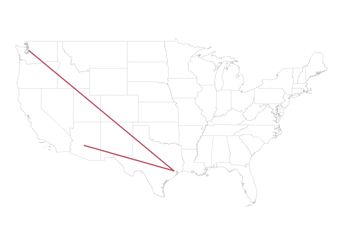
After calling our distance_linestring function we take the output d1 and plot it on our basemap.
Code
# set up base mapbase_map <-ggplot() +geom_sf(data = usa_map, fill ='#FFFFFF', color ='#BBBBBB')base_map +geom_sf(data = d1, color ='#BB5566', linewidth =1) +theme_void()
And there we go! A single journey.
Drawing a lot of lines
A more common example might ask us to visualize patterns that many people take - for instance, all participants of a longitudinal survey. We can easily extend the function defined above and wrap it in a for-loop. To illustrate what this looks like I simulate some data for 100 theoretical trips between 2 and 5 cities:
Code
# OK, let's simulate 100 people travelling up to 5 cities# then we store the results in a list and plot them on a base maplinestring_list <-list()iter =100max_N =5for(i in1:iter){ k <-sample(2:max_N,1) N <-sample(1:length(cities_sub),k) linestring_list[[i]] <-distance_linestring(cities_sub[N,])}# reset basemapbase_map <-ggplot() +geom_sf(data = usa_map, fill ='#FFFFFF', color ='#BBBBBB')# iterate through the list of locations and add each to the plotfor(p in1:length(linestring_list)){ base_map = base_map +geom_sf(data = linestring_list[[p]], color ='#BB5566', linewidth =1, alpha = .2)}
So we just simulate a lot of journeys that go between 2 and 5 states, store them in a list, then run our linestring_list function over it. The for-loop to add lines is a bit hack-y, but it works. We can then just plot them out:
Code
base_map +theme_void()
And if we want to know how far, on average, each person traveled, we can just compute the sum of distances across our list. Simple!
Code
# distance in metersdists_m <-sapply(linestring_list, st_length)hist(dists_m/1609, xlab ="Distance in Miles", main ="Miles Travelled")
Full Data
Code
library(tidyverse)library(sf)set.seed(111424)# load data# cities data: https://simplemaps.com/data/us-cities# usa states: https://www2.census.gov/geo/tiger/GENZ2018/shp/cb_2018_us_state_500k.zipcities <-read_csv("./data/uscities.csv")usa <-st_read("./data/usa_states/cb_2018_us_state_500k.shp")# create a base layer mapusa_map <- usa %>%filter(NAME %in% state.name,!NAME %in%c("Alaska", "Hawaii")) %>%st_transform(crs =4326)# subset 50 largest us citiescities_sub <- cities %>%filter(state_name %in% state.name,!state_name %in%c("Alaska", "Hawaii")) %>%slice(1:50)# function to iterate through n number of points# given some input distance data 'dd'# function expects to see a lng, lat# and rows sorted by sequencedistance_linestring <-function(dd){ points_list <-list() idx =1for(i in1:nrow(dd)){ points_list[[idx]] <-st_point(c(dd$lng[idx],dd$lat[idx])) idx = idx+1 } ls =st_linestring(do.call(rbind, points_list)) %>%st_sfc(crs =4326)return(ls)}# let's draw a line between three random citiesd1 =distance_linestring(sample_d)# set up base mapbase_map <-ggplot() +geom_sf(data = usa_map, fill ='#FFFFFF', color ='#BBBBBB')base_map +geom_sf(data = d1, color ='#BB5566', linewidth =1) +theme_void()# OK, let's simulate 100 people travelling up to 5 cities# then we store the results in a list and plot them on a base maplinestring_list <-list()iter =100max_N =5for(i in1:iter){ k <-sample(2:max_N,1) N <-sample(1:length(cities_sub),k) linestring_list[[i]] <-distance_linestring(cities_sub[N,])}# reset basemapbase_map <-ggplot() +geom_sf(data = usa_map, fill ='#FFFFFF', color ='#BBBBBB')# iterate through the list of locations and add each to the plotfor(p in1:length(linestring_list)){ base_map = base_map +geom_sf(data = linestring_list[[p]], color ='#BB5566', linewidth =1, alpha = .2)}base_map +theme_void()# distance in metersdists_m <-sapply(linestring_list, st_length)hist(dists_m/1609, xlab ="Distance in Miles", main ="Miles Travelled")